The Revolutions Display Font for Bold Digital Identity
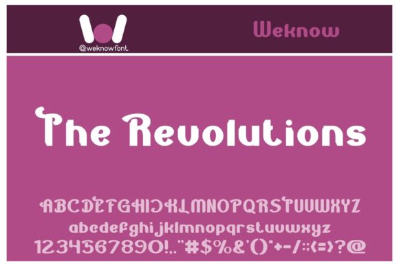
As a UI designer who ships landing pages, SaaS dashboards, and brand-forward web experiences, I reach for display fonts like The Revolutions when I need typography that commands attention without sacrificing clarity. It’s not just decorative—it’s functional storytelling in letterform. With its sharp geometric structure, subtle angular contrast, and confident rhythm, The Revolutions bridges retro-futurism and modern digital polish. Think of it as the typeface you’d trust to headline a synthwave album cover, anchor a boutique fashion e-commerce banner, or define the visual voice of an indie game studio—without feeling dated or overly niche.
In practice, The Revolutions excels where hierarchy matters most: hero sections, product launch headlines, course title cards, and CTA banners. Its uppercase-dominant design delivers strong visual weight at large sizes (48px and up), making it ideal for responsive hero text on desktop and tablet. On mobile, I use it sparingly—typically at 36–42px with generous letter-spacing (0.05em–0.1em) and tight line-height (1.1) to preserve legibility against image overlays or gradient backgrounds. It performs especially well over dark mode interfaces or high-contrast photography, where its crisp terminals and open counters prevent visual bleed.
This isn’t a body font—and it shouldn’t be. The Revolutions is a display font, built for impact, not endurance. Use it for short, high-intent phrases: “Launch Your Vision,” “Limited Edition Drop,” “Season One Is Live,” or your brand name in a logo lockup. In portfolio sites, I’ve paired it with Inter or Manrope for clean, accessible body copy—creating instant tonal contrast between expressive authority and approachable readability. For editorial-leaning digital brands (think creative agencies or design blogs), pairing The Revolutions with a warm serif like Playfair Display adds gravitas while keeping rhythm grounded.
What sets The Revolutions apart from other display fonts is its restrained personality. It avoids excessive ornamentation or forced novelty, which means it scales across contexts without clashing: a music festival website, a premium skincare brand’s homepage banner, a tech podcast’s episode title graphic, or even a printed book cover exported from a web-first design system. Its consistent stroke modulation and balanced proportions ensure it renders cleanly across browsers—even with variable font fallbacks disabled—and holds up in SVG-based logos embedded directly into HTML.
For conversion-focused layouts, timing and placement matter more than size alone. I reserve The Revolutions for the first 1–3 words users see: the headline above a sticky CTA button, the tagline beneath a product thumbnail carousel, or the bold header inside a modal announcing a limited-time offer. That intentional scarcity builds anticipation and reinforces memorability. On Shopify stores using custom themes, I apply it only to collection headers and featured product titles—not category menus or filter labels—so users associate its presence with value and distinction.
Responsive behavior is predictable but requires testing. At 24px on narrow viewports, readability dips unless background contrast is high (WCAG AA minimum). I avoid using it in navigation bars, footer links, or form labels entirely. Instead, I deploy it in section dividers: a full-width banner with centered The Revolutions text overlaid on a muted video background, or a split-screen layout where it anchors one side while body copy occupies the other. These uses reinforce spatial hierarchy without compromising accessibility.
Licensing is straightforward but critical: The Revolutions is a commercial font, and its webfont files must be served via licensed CDN or self-hosted with proper domain permissions. If you’re building templates for clients or selling digital products (like Notion kits or Figma UI libraries), verify the license covers redistribution and SaaS embedding. Most reputable vendors include WOFF2, WOFF, and EOT variants—prioritize WOFF2 for modern browser support and faster load times. Check whether stylistic alternates or multilingual glyphs (e.g., Latin Extended-A, Vietnamese diacritics) are included; they’re essential if your audience spans global markets or includes bilingual content.
Pairing strategy is where The Revolutions reveals its versatility. With sans serifs, it gains energy—try it beside Space Grotesk for tech-forward brands or Clash Grotesk for playful startups. With serifs, it gains sophistication: IBM Plex Serif balances its geometry with organic warmth, while Source Serif Pro creates elegant tension in magazine-style blog headers. Avoid pairing it with other display fonts—especially scripts or handwritten styles—unless you’re intentionally designing for maximalist social media graphics (e.g., Instagram story templates). Even then, limit usage to single-line accents.
In brand identity systems, The Revolutions works best as a *tone amplifier*, not a standalone solution. When used consistently across email headers, app onboarding screens, and digital ad creatives, it trains users to recognize your brand’s confidence and creative precision. I’ve seen it strengthen perceived professionalism for coaching websites—where clients equate typographic boldness with expertise—and elevate perceived value in digital course sales pages, where the font signals “this isn’t generic content.”
Ultimately, The Revolutions earns its place in my font stack because it solves real problems: cutting through algorithm-driven feeds, anchoring emotional resonance in fast-scrolling interfaces, and unifying visual language across touchpoints—from a mobile app splash screen to a PDF brand guideline. It’s not about being flashy. It’s about being unmistakably *yours*—in every pixel, every viewport, and every user’s first impression.